

Editing Lunar Photos Without Losing Natural Detail
Why the Moon Punishes Heavy Editing
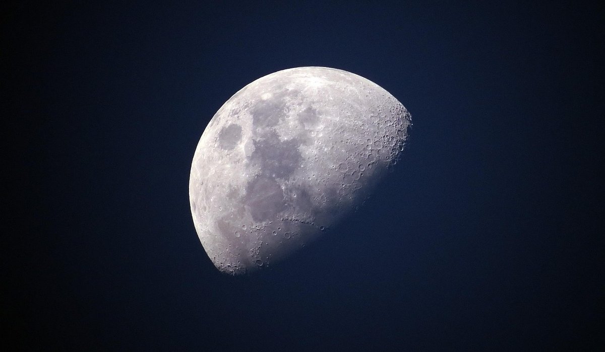
The Moon is the brightest object most of us will ever photograph from a back garden, and that brightness is exactly why beginners get caught out. Lunar detail lives in a very narrow band of tones. The crater rims along the terminator — that ragged line between light and shadow — are only a few percent brighter or darker than the plains beside them, yet they are where all the drama sits. Push contrast too far and those subtle gradations collapse into flat black and blown white. The result looks punchy on a phone screen and disappointing on anything bigger.
UK conditions add another layer. Our seeing is often soft, with the jet stream doing its work above us, so fine detail arrives gently blurred. It is tempting to compensate by dragging the sharpening slider to the right. Resist that urge. Sharpening cannot create detail that was never captured; it can only make the edges of what you have more obvious, and past a certain point it invents things that are not there.
Contrast and Clarity: Small Numbers, Big Difference
Think of contrast as a volume knob and clarity as a texture enhancer. Both are useful, both are easily overdone. As a starting point for lunar work, try a contrast increase of just 5 to 12 points, watching the terminator as you go. The moment the shadowed limb turns into a solid black shape with no faint detail inside it, back off a few points.
Clarity, structure, or micro-contrast sliders — different software calls it different things — should be treated with even more caution. On a lunar frame, +5 to +15 is usually plenty. Clarity works by boosting local mid-tone contrast, which is wonderful for the maria, the dark plains that give the Moon its familiar face. Overdo it, however, and the smooth floors of craters like Plato start to look mottled and grainy, as though the surface has been sandpapered.
- Apply contrast before sharpening, never after.
- Zoom to 100 per cent and check the terminator, not the bright limb.
- If a crater floor looks noisy rather than smooth, reduce clarity first.
- Work on a duplicate layer or a virtual copy so you can compare with the original.
Taming the Bright Limb and the Deep Shadows
The Moon has a dynamic range problem: the sunlit limb can be several stops brighter than the shadowed side. Rather than lifting the shadows hard, try pulling the highlights down by 10 to 25 points and raising the blacks slightly so the darkest craters keep a little texture instead of clipping to pure black. A gentle S-curve in the tone controls often achieves the same thing more gracefully than a contrast slider alone.
If you shot in raw, you have room to recover the bright southern highlands and the rays around Tycho. If you shot JPEG, be more conservative — there is less data to work with, and pushing shadows will bring out compression artefacts that look like fine fabric rather than lunar surface.
Sharpening Without Halos
This is where most lunar edits go wrong. Over-sharpening produces a bright rim on one side of every crater edge and a dark rim on the other. Astronomers call these halos; they make the Moon look embossed and artificial, like a coin rather than a world. Once a halo is baked in, it is very hard to remove.
Use unsharp mask with a small radius of roughly 0.8 to 1.5 pixels, an amount between 40 and 80 per cent, and a threshold of 3 to 10. That threshold is your friend: it stops the filter sharpening smooth areas and amplifies noise only where there is real edge contrast. If your software offers a high-pass method, a radius of about 2 pixels with the layer set to overlay at 30 to 50 per cent opacity gives a similarly restrained result.
- Sharpen at 100 per cent zoom, never at fit-to-screen.
- Apply sharpening last, after noise reduction and any tonal work.
- Compare before and after by toggling the layer; if you cannot see the difference, that is often correct.
- Use a light touch of luminance noise reduction before sharpening, but keep detail sliders low so craterlets in Clavius survive.
Colour, White Balance and the Grey Truth
The Moon is essentially grey, with only faint mineral colouring — slightly warm in some maria, slightly cool in others. Avoid saturation boosts; they turn those subtle tints into a lurid yellow or blue that no telescope will ever show you. Set white balance from a neutral region such as a large mare, or simply keep it daylight. If your image looks a little green or magenta after editing, a tiny tint correction is fine, but leave saturation at zero.
A Workflow You Can Repeat
Start with white balance and a light crop. Apply modest highlight recovery, then a small contrast or gentle S-curve. Add clarity in single-figure increments, checking the maria as you go. Reduce luminance noise if needed, then sharpen with a small radius and a sensible threshold. Finally, resize for your intended output and, if you are downsizing, sharpen very slightly afterwards.
Save a copy with your settings written down. Next clear night, before you even open the editor, look at the Moon through the eyepiece and remind yourself what real lunar texture looks like — soft, gradual and full of tiny gradations. That memory is the best guide you have. Edit towards it, and your photographs will keep the quiet, textured honesty that makes the Moon worth photographing in the first place.


Stargazing
-
Shield outdoor lights, close curtains and choose the darkest corner of your garden. Small changes can noticeably improve contrast for lunar and planetary viewing.

Telescopes


-

Long established fact that a reader will be distracted
-

Long established fact that a reader will be distracted
-

Long established fact that a reader will be distracted


Lunar Phases
Karla Gleichauf
12 May 2017 at 05:28 pm
On the other hand, we denounce with righteous indignation and dislike men who are so beguiled and demoralized by the charms of pleasure of the moment
M Shyamalan
12 May 2017 at 05:28 pm
On the other hand, we denounce with righteous indignation and dislike men who are so beguiled and demoralized by the charms of pleasure of the moment
Liz Montano
12 May 2017 at 05:28 pm
On the other hand, we denounce with righteous indignation and dislike men who are so beguiled and demoralized by the charms of pleasure of the moment